Showing posts with label Character Design. Show all posts

Monday, July 28, 2014

A Study in Scarlet

Clever name huh?

Sorry to disappoint but this post has nothing to do with Sherlock. Sorry.

But I had some downtime at work today, and I haven't really done much character designing or pin ups lately...

(I have been working on comics and stuff for work, neither of which I can really post publicly, that's why I have been in hiatus so long. Sorry about being AWOL y'all)

I also thought it might be cool to show the process of this image, especially cause I drew this on my cintiq. Having to learn how to work heavily on the computer has been a blessing as well as a hardship. 

A little background, I love G.I. JOE. Anyone who is friends with me knows that this news is no surprise, I have always loved it, and my love for comics has only led me to want to read G.I.Joe comics. The only problem, is I don't think the franchise has ever gotten the artistic talent for the books that it really deserves, and I have always wanted to work on a GI Joe comic.

 So I have been doodling those characters for a long time, and one of my favorites is Scarlet. She is just a really cool character, and I love that when I draw her I can get away from the typical comic girl stereotype where the girls have obscenely large chests and hips and tiny waists that make no physiological sense whatsoever. I get to draw a woman who is a fighter, who is in shape, and could either beat you to a pulp, or sweep you off your feet. That's an awesome character to me. 

So here is the picture!
This is the 'final product' of this couple hour drawing and quick coloring.

So here is the process for you to see how I made this!

 so first I toned the canvas, and drew out my sketch. 


 Once the sketch was done, I lowered the opacity on the sketch and went into the final lines.


 Here is the final lines, with the sketch layer turned off. 'Erased' if you will.

 Here is where I added my local colors, with a pressure opacity brush. (Harder I press, darker color gets for all you non-photoshop people out there.)


 I added a lithe bit of highlighting behind her, just to let there be a little more focused area in the drawing itself.


Thought it needed a bit more in the background, but something more graphic. I actually made a solid rectangle behind her, and didn't like it, so I started erasing and the haphazard streaks behind her looked so cool, I kept it. Added her signature color and her name and the drawing was finished!


Well thanks for reading through that crazy long post. Well long for me. And I promise, I will try to be more blogworty in the future, I do draw a lot, and all the time, so I will be sure to try to update a little more often. 

Thanks for reading, have a wonderful day.

-Colin


Tuesday, February 4, 2014

Gun Totin' Granny

Hey there,

So as I mentioned in the last post, at work we have these times for the designers known as "Draw Time Fun Time", and so I thought I'd post the second one I have done for this round.

This time we were tasked to draw an old lady and her male counterpart, and what will happen next is we will hand the characters off to the writing team here, and they will create a story about them. So its pretty open ended and fun.

So here's what I did.


Again, another fully digital image. I am getting a little more comfortable on the Cintiq, but I will say, it still never feels the same as using good ol' pen and paper. I definitely miss drawing these things traditionally, but unfortunately I do not have a scanner right now, so I am forced to learn and work with other methods. Hope you enjoyed!

Until next time!

-Colin

Friday, July 19, 2013

Just A Few Sketches

Hello y'all,

So again, I get all caught up in life and totally forget that I have a blog and why I created it. To post ART! So That's what I'm gonna do. I have some stuff that I am currently working on, but nothing is finalized yet, so I'm not sure if I can publicly post it, so I'll post some of the sketches I did for said project.

I'm sort of messing around with a different inking style. 
We'll see how it goes.

There is obviously a theme between these drawings, but I'm just going to let you figure that one out!
Anyway, more to come when I can get to it! Happy trails!

- Colin

Thursday, November 17, 2011

SILVERHAWKS revamp

Hello there my faithful blog viewers.

So I want to start off by saying that nostalgia is a great thing, especially for 80's and 90's T.V. shows that were pretty much by any of today's standards, terrible. But to be able to think back on how great they were when you were a kid, that kind of nostalgia.

I start this post with that because our final assignment in my Character Design for Storyboarding and Animation class was to revamp an old television show. Preferably one that wasn't terribly great to begin with. Well of course I had like 40 million ideas!

After I sifted through all of the options, I finally settled on the show SILVERHAWKS. Now in case you don't actually know what this is, you're in luck, cause I'm gonna tell you.

You're Welcome....

Anyway, Silverhawks was made by the same guys who did Thundercats, essentially the show was supposed to be like Thundercats in space. This team known as the Silverhawks were cybernetic beings, as the quote in the intro video claims "partly metal, partly real." Essentially these guys flew around space battling a big boss called "Mon-Star" (I know, these guys had real imaginations back then) and he pretty much looked like a mean thundercat. Anyways, he was an intergalactic mob boss who was trying to rule the galaxy. The Silverhawks would pretty much foil his plans everytime, and like the cartoons of the late 80's there were a plethora of bad guys that worked under Mon-Star, and at least one perfect foil for each of the Silverhawks.

There, I just saved you from watching like 70 something episodes. This show used to be one of my favorites, and I remember watching it with my brother a lot when I was younger (aww more nostalgia!) but I thought it would be a super fun project to revamp their designs and get to do Silverhawks the way I would do it.

So here's the Art!

The newly redesigned logo and text. 

The Good Guys:

This is Tally-Hawk, it's a robotic hawk
 that the main character Quicksilver uses. 

This is Quicksilver, the leader of the Silverhawks

This is Steelwill, the muscle of the Silverhawks

This is Steelheart, she's a gearhead 
along with her bother Steelwill

This is Colonel Bluegrass, he's a regular ol' cowboy.
 He is the lead pilot for the Silverhawks

This is Copper Kid, he is the only non-human Silverhawk,
He fights with frisbee-like disks,
 and he is the co-pilot alongside Blugrass.

The Bad Guys:

Here is Mon-Star, the galactic crime lord himself.

This is Yes-Man, he is Mon-Star's 
number one assistant/lackey. 

Environments:

The interior of the Silverhawks command center

The exterior, showing the Mirage flying away from the command center

Expressions:

We only had to do expressions for one character, so I chose Quicksilver

Whew, so how did you like all of that artwork?! That's not even all of it! I have storyboards for the intro, but seeing as how this post is crazy long as it is, I will do another post just for the storyboards. Like always, feel free to post feedback, I'd love to hear what y'all think about my project.

-Colin


Tuesday, November 1, 2011

Time to play catch-up!

Oh hey blogdience!

So, my bad that I haven't uploaded anything in a while, you know how that whole life-thing gets in the way of doing anything fun. Even when your life is full of comic books and movies.

ANYWHO...Here we go, first couple images are from a project I did way back in the quarter, where we had to do some character designs for the show ADVENTURE TIME. I guess I'm not like the normal hipster crowd here, but I actually don't watch the show, like, ever, so creating characters in a foreign style was...well it was interesting. The first one is a garbage collector we had to create, of the two this one is my favorite.
"He's a nice guy, just got a crappy job."

Anyway, I like him, but I sort of over rendered him, he should've stayed as flat colors, but oh well, I like him anyway. Now the next one was this description of a character we had to make, and it was something like "golden pig armed beast with intestines falling out"..Yeah, you're probably thinking what I was thinking...

What?

Anyway after wrapping my head around it, I came up with this. 

Yeah, this is what I came up with. 
It was the least grotesque way I could figure it. 

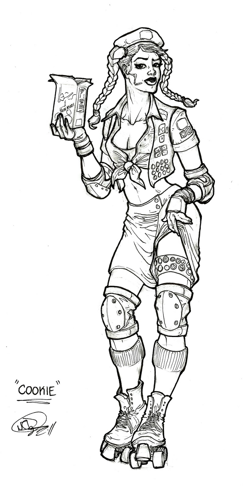
So that was the ADVENTURE TIME projcet. Glad that's over with! So the following one that we did was the mascot, which I did Captain Caffeine and you can refer to the previous post to see that one, but after that we did a poster design for the Savannah Derby Devils, the roller-derby team in Savannah. We first had to come up with a character design, here's mine.

So I did a Girl Scout! I mean, what's more empowering to girls, 
and ALSO has close ties to Savannah! I also named her "Cookie Cutter"

So that was the initial character design I came up with, so after the critique I made the actual "poster" for the assignment, it looks a little something like this:

"I'm no cookie cutter, I cut the cookie, and I WILL CUT YOU!"

I'm very happy with how this poster turned out actually, It's a different style of rendering, and also its an entire female cast on the page, which is a rarity...although I'm meaning to change that. 

The last one I am going to share with you today is an image I actually finished a few hours ago. So if you recall a few posts back, I drew a picture of "The Incredibles" well, for my digital coloring class, I decided to color it. I have been waiting to do it, and I'm excited for the way that it turned out!

It's finally colored!! I am quite pleased with it actually!

So anyway, that's all I'm gonna post for now. I hope y'all like these pictures, I will try to be more regular in posting my pictures, I gotta make sure I keep it a priority! Talk to you later bloggers!

-Colin


Wednesday, October 12, 2011

CAPTAIN CAFFEINE

hello my dear blogdience,

 I am sorry that I have not been too diligent about updating, I have been a bit busy...And by bit I mean that I am running myself ragged and am just happy by the grace of God that I am still breathing! But anyway, heres a project update for ya!

We had to make a character redesign for mascots. Mostly mascots for brands and other things of that nature, well I made my own up, cause I like to be a hassle! 

So I did Captain Caffeine!! The un-official mascot of Folgers coffee! I actually had super fun with this, and I want to share it with the world!

ITS THE BEST PART OF WAKING UP!!!


So thats it, I will post more of the character sketches when I'm less busy! See you later blogdience!

-Colin

Monday, September 26, 2011

Some New Stuffs

Good evening polar bear enthusiasts,

  I wanted to share some new stuff I made for you guys! I know that last sentence may seem like I legitimately made these things for you, but alas, I did not, it was for class you just get to reap the benefit of seeing them. Just wanted to clear that up. 

Here is the first stuff, we had to make the two "Boss" type characters for my Character Design class, one large brutish creature and then a minion. So I used the best inspiration I know of...the Bible! There is a beast in the book of Revalation that has seven heads with ten horns and looks like a leopard with one head like a lion. Whew, that was a lot to get out, anyway, I used that as my primary inspiration. 

I want his fur!!

Now for the second creature, 
he is sort of the brains of the operation you could say. 
Not as large or intimidating by far.

He's very Shakespearean...with the skull and whatnot...

Alright now, here is the next project, 
we had to make a rockstar character for a type of Guitar Hero game.
Now, I'm a really big fan of "Tron" 
and considering that I dont really follow music,
 I just decided to make a guy that looks like he belongs in the world of "Tron"

His name is "Hexi-Decible" Yes, the drawing on the left is a little out of proportion, but I just wanted to highlight the suit. One of the biggest goals I had with this project was to create a character the was almost in complete silhouette, because most of my stuff is very detailed oriented so I wanted to deviate from that and try something new. 

Yeah, I'll be honest, I sort of only wanted to draw this guy to make him smashing a guitar that is shattering into pixels like in the movie. This was kinds the only picture I cared about. I am not a huge fan of the background being black, but I am gonna work on that, I don't have wonderful Photoshop skills as of yet, so for the time being it is just going to have to stay that way. 

Okay well that's all I have for you guys so far. I will continue to keep you posted on the happenings in my art-life! Let me know what you think, as always, comments are greatly appreciated! 

-Colin


Thursday, September 8, 2011

Golem of South Florida Updates

Greetings Blogdience!

I am back!!! Many things have happened during my blogging hiatus, all good things, there were no infectious outbreaks that caused the world to go in to a paranoid panic, although, that would have made it a very memorable three weeks...

Anyway, some of you know I am working on a comic project titled "the Golem of South Florida" I am not the writer, I am merely the artist. The benefit for you my blogdience, is that you get to see the progress and know nothing about the story! Muahahah! But you will, once it's done at an undetermined time! Cause then you can buy it and make it popular and I would like that very much! Anyway, here are some character sketches that I have completed, put out here for your criticism and or enjoyment! (I hope enjoyment)


this little dandy is the "Golem of Danzig" he fights in WW2. 

See, I told you he fights in WW2!

This guy's name is Sid..That's all you get to know!

This jolly fellow is "Big Pharm"...
think "Bane" but a lot goofier.

This is Dr. Nautical. He's a pirate.

This is Sarah. 
She fights with the Golem of Danzig in WW2.

this is my last one, his name is "Mystic Mike"


Anyway, I hope you liked these, even though most of you have absolutely no idea who these characters are, what their roles are and why you should care. Well, just enjoy them and the the comic comes out you can be like "oh hey I saw the original designs for these people on this one blog thing!" and it will be my blog thing and I will feel warm and cuddly on the inside.
Until we meet again blogdience!

Colin

Friday, August 19, 2011

SEVEN DEADLY SINS WRAP UP!

Oh Hai,

Well blogdience, the blood sweat and tears have paid off and I'm happy to show you the final Seven Deadly Sins images. I even present it to you in a hi-res scan, almost like its in HD. Its also being shown in 3d, all you have to do is smash your face through the monitor, (please don't do this, this is a bad attempt at sarcasm and if you take it seriously, its sort of your fault). 

Anyway, I will start off with the eighth picture which is the whole "promo poster" with all of the images merged together, then I will go through them in their color order.

Here is the big ol promo poster. I think it's fun.


Rawr, I'm angry. So wrath-ey.

Lust. I'll be honest,
 I think this one is the prettiest. 
I guess, it's fitting. 
I guess...

Gluttony...fat and jovial. Like Santa.

Greed means Benjamins Everywhere!

Here's Envy, and I also really like this one. 
I'm a fan of the bling.

Super Slothtastic.

Mirror Mirror on the wall, 
who's the most Prideful of them all?

Alright, I hope you all liked them. I worked my butt off, and I hope everyone likes them, they will be hanging in my house when I get back to Savannah. It'll be a good wall decoration. Well I'll talk to you later Blogdience! 

Colin


Monday, August 15, 2011

Los Increibles

Blogdience,

Okay so I have had the weirdest desire to draw the Incredibles. But, in a proper superhero treatment. So as a break from drawing real serious things, I drew a fun drawing, one that I have wanted to do. Its not the cleanest and greatest, but it's fun and at least it's now off my mind and I can continue working on real stuff now. I hope you enjoy, sorry my scanner isn't big enough for the image, so there is some croppage.
Like I said, cropped, but you get the gist. 
Its for fun.

Anyway, hope you enjoyed it. Keep on keepin' on blogdience..

Colin

Friday, July 8, 2011

BEARS BEARS BEARS!!!

BLOGDIENCE,

Hey there y'all. So some of you who know me know that I have this goofy comic strip I work on from time to time just as something for fun and amusement. Well, I haven't done them for a while, but I am proud to say I made two strips the other day, and am happy to re-introduce my strip to the world!

For those of you who don't know, the strip is called "Life's a Bear" and it takes place in a zoo. It's about an eccentric and slightly moronic polar bear who is put in an exhibit with a sarcastic and easily annoyed panda bear. Essentially it's their interactions as they are stuck with each other in this bizarre exhibit.

So here it is : "Life's a Bear"


Alright, well I hope you liked them, I'd be more than happy to hear your thoughts on them and comments on how funny or stupid you think they are, critique always helps!

Gracias por los pantalones!

Sir Dyer

Monday, May 23, 2011

Fantasy!!

Hello there web-world!


Oh hello blog-world! So much has happened since we last met, and by so much, I mean not really anything different from the norm. I am however closer to the end of the quarter, which is happy news, except for that whole stressful finals thing, I could go without that.

 Anyway, an update on fun art. I did some illustrations for class, one was supposed to be a fantasy illustration, and another one an illustration of what was happening in the real world. We had to use colored pencil and watercolor. And we weren't allowed to use ink, for outlining or anything. I wasn't so much a huge fan of this to be honest. But anyway, I did it. And am done with it. Finally. Enjoy!


So its a kid playing in a box. Who didn't do that
I mean really?! This was the second one I worked on, 
I don't like it as much as the first one. 


This is the second one. 
Obviously I spent a bit more time on this one.
 I like it a lot more.


Anyway, I hope you like dem illustrations! Im certainly glad I'm done with them, cause now its time to move on with my life and go on to my final! hooray!

Until next time my fair blog,

Colin